Flattening the Flattenable
Author: Federica Sofia Zambe
Interview with Martina Pauková
Who influences you graphically?
It is so hard not to get heavily overstimulated by the sheer amount of good stuff around, hmm! If I have to pick – I’ve been an ongoing fan of Yuichi Yokoyama and his half abstract and half figurative and amazingly coloured works; super big fan of mad James Juliano Villani, my recent discovery is American Mernet Larsen – 75 years old painter and her very still yet narrative and very everyday scenes. From the contemporary illustration world I can’t omit Patrick Kyle, Jack Sachs and Nicolas Menard whose everything I just drool over.

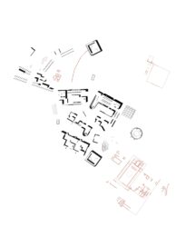
Within each image there is a great play between the various forms of representation, from elevation to axonometric to plan. How did you develop this particular style and what is the outcome?
I must say I feel that I am arriving at more solidified visual style only now; at the very beginning I’d be drawing shapes, daily objects and catering products and I still remember conversations with my then boyfriend deciding to draw people and I did! Very slowly the first characters appeared along with occasional cheap metaphors thrown in (my “conceptual stage” haha), and eventually I’d start focusing solely on rather mundane daily scenes filled with lanky men and women going on with their life. And this is when the play with perspective happened – initially coming from the pure want to fit many objects in given space without having to sacrifice their “graphicality”, it eventually evolved into full on ironing down, I tend to flatten everything that can be flattened!

What defines your colour palette for each image? Do you pose any colour restrictions in terms of a maximum/minimum?
I dare to say that my colour is super arbitrary! No planning ahead, no particular mood on mind, it happens rather intuitively once the picture itself is finished and colouring is to come. This is when the browsing and taking notes of colours around me come into place and certain want of certain mood appears almost naturally. What follows is colouring the picture with colours that I liked the combination of and then finetuning it all till the colours click. As for number of colours used – I like to limit them to 3-4, to keep certain legibility in place and which also makes me distribute them across the picture with higher level of care, and that is always a a good thing.

Have you ever thought of inverting the image so that the lines defining the objects are ‘coloured’ whilst the image remains in black/or white?
Actually I haven’t! Although I have been playing the idea of introducing new steps into my workflow, in couple if images already I left couple of objects just in an outline taking on the fill colour form whatever object lies beneath. But am definitely open to new processes and trials, just waiting to have a bit of time on my hands.


